Ever walked into a room and instantly felt a shift in your mood? While many factors contribute to a space’s ambiance, the art adorning the walls and shelves plays a surprisingly significant role, particularly through the language of color. It’s not just about aesthetics; it’s about the profound psychological impact that hues can have on our emotions and overall well-being.
Choosing art with intention means understanding this silent dialogue of color and consciously using it to sculpt the emotional landscape of your home. Forget fleeting trends or what you think you should like. This is about tapping into the inherent power of the spectrum to create spaces that truly resonate with how you want to feel.
The Unspoken Language: Understanding Color Psychology
Color psychology is the study of how colors affect human behaviors and emotions. While individual experiences and cultural contexts can influence our perceptions, certain color associations tend to be fairly universal. Understanding these basic principles can be a powerful tool in curating an art collection that actively contributes to the desired mood of your home.
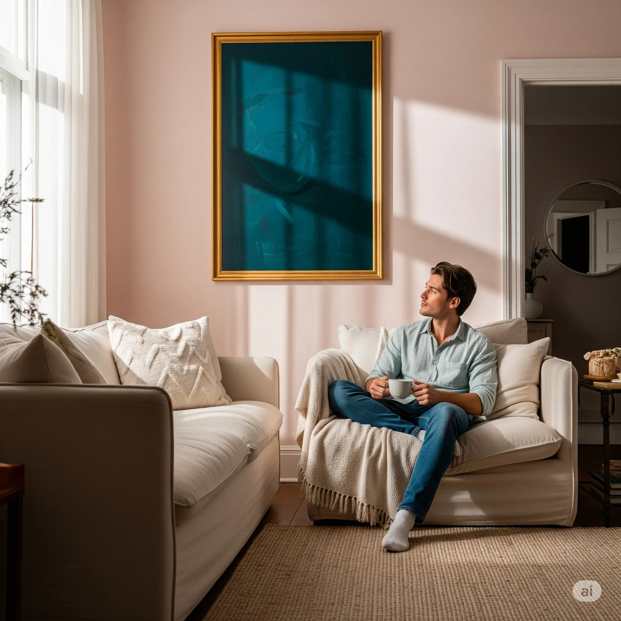
- Blues and Greens: Often associated with tranquility, peace, and nature. Blues can evoke feelings of calmness and serenity, while greens can be refreshing and promote a sense of balance and harmony. Art featuring these colors can be ideal for bedrooms, bathrooms, or areas where you seek relaxation.
- Yellows and Oranges: Radiating warmth, optimism, and energy. Yellows can be uplifting and promote feelings of happiness, while oranges blend the energy of red with the cheerfulness of yellow, often associated with enthusiasm and creativity. Use these colors strategically in living rooms, kitchens, or home offices where you want to foster a vibrant atmosphere.
- Reds and Pinks: Evoking passion, energy, and sometimes intensity. Red can be stimulating and attention-grabbing, associated with excitement and even anger. Pink, on the other hand, often carries softer connotations of romance, tenderness, and comfort. Use reds as accents or in areas where you want to create a focal point, while pinks can add a touch of warmth and intimacy to various spaces.
- Purples: Often linked to creativity, luxury, and spirituality. Lighter shades of purple can feel calming and contemplative, while deeper purples can evoke a sense of mystery and sophistication. Consider using purples in creative studios or spaces where you seek inspiration.
- Neutrals (Whites, Grays, Beiges, Browns): Providing a sense of calm, sophistication, and grounding. Neutrals can act as a backdrop that allows other colors to pop or can create a serene and minimalist feel on their own. The texture and tone of neutrals can significantly impact the overall mood, with warmer browns and beiges feeling more inviting than cooler grays and whites in some contexts.
Sculpting Atmosphere: Color in Different Rooms
Now, let’s consider how to apply this understanding of color psychology when choosing art for different areas of your home:
- Creating a Calm Bedroom Oasis: Opt for art featuring soft blues, gentle greens, or muted purples. Abstract pieces with flowing lines or serene landscapes in these palettes can promote relaxation and prepare you for restful sleep. Consider the undertones; a cool blue might feel more tranquil than a very saturated one.
- Energizing Your Living Spaces: Inject vibrancy with art that incorporates yellows, oranges, or even carefully chosen pops of red. Abstract expressionism, dynamic cityscapes, or still life with warm tones can invigorate the space and encourage social interaction and lively conversation.
- Fostering Focus in Your Home Office: Greens and blues can again be beneficial here, promoting clarity and reducing stress. However, don’t shy away from subtle hints of yellow or orange to spark creativity. The key is to avoid overly stimulating or distracting color combinations.
- Welcoming Guests in Your Entryway: Consider art that reflects your personality and sets a positive tone. Depending on your style, this could be a bold piece with warm colors or a more serene artwork with inviting neutrals and a touch of color that hints at the atmosphere within.
- Adding Serenity to Bathrooms: Blues and greens are natural choices, echoing the association with water and nature. However, don’t overlook the calming effect of soft whites, beiges, or even light grays, especially when paired with natural textures.
Beyond the Dominant Hue: Considering Undertones and Combinations
It’s not just about the main colors in a piece of art; the undertones and how colors are combined also play a crucial role in its emotional impact. A blue with a hint of green will feel different than a blue with a touch of violet. Similarly, the way colors interact – whether they are complementary, analogous, or contrasting – will influence the overall feeling of the artwork.
Experiment and pay attention to your own reactions. Do certain color combinations make you feel energized or agitated? Do others evoke a sense of peace or melancholy? Your personal response is just as important as the general principles of color psychology.
Trusting Your Instincts: Making it Personal
While understanding color psychology provides a valuable framework, the most important aspect of choosing art for your emotional sanctuary is your personal connection to it. Don’t feel confined by rules. If a predominantly red abstract painting brings you joy and energy in your bedroom, then it’s the right choice for you, regardless of conventional wisdom.
The goal is to create a home that reflects your unique emotional landscape, and the colors you surround yourself with should be a testament to that. Trust your instincts, explore different palettes, and don’t be afraid to curate a collection that speaks directly to your soul, one colorful piece at a time.
The Ever-Evolving Palette: Your Home’s Changing Mood
Just as your own emotions fluctuate, the way you interact with color can also evolve. Don’t feel that the art you choose today has to be the art you live with forever. Be open to rearranging your collection, adding new pieces with different color stories, and even letting go of art that no longer resonates with your current emotional state.
Your home is a living, breathing reflection of your inner world, and the colors you choose to surround yourself with are a powerful tool in shaping its ever-changing mood. Embrace the journey of discovery, and allow the intentional use of color in your art to transform your house into a true haven of comfort and emotional well-being.