Color is one of the most powerful tools in interior design. It sets the mood, defines a room’s character, and brings energy and personality to your space. But using color effectively requires balance. Too much can feel chaotic, while too little may feel bland or uninspired. In this guide, you’ll learn how to decorate with color in a way that enhances your home—without overwhelming the room.
Understand the Basics of Color Psychology
Color affects how we feel and how we experience a space. Before choosing a palette, consider the emotional tone you want to create.
Common Color Moods:
- Blue: Calming and cool, ideal for bedrooms or bathrooms.
- Green: Balancing and refreshing, great for living rooms or offices.
- Yellow: Cheerful and energizing, best in kitchens or creative spaces.
- Red: Passionate and bold, ideal as an accent in dining or entry areas.
- Neutrals (gray, beige, white): Grounding and versatile, perfect as a base.
Use these emotional cues to guide your color decisions based on the room’s function.
Start with a Neutral Foundation
A neutral base helps create balance and prevents your space from feeling too busy. This foundation allows you to add color thoughtfully in layers.
Neutral Base Tips:
- Use light tones like white, gray, or soft beige on walls and large furniture.
- Keep flooring and ceilings simple to create visual calm.
- Let neutral tones dominate 60–70% of the room for grounding.
This creates visual “breathing room” and makes colorful accents pop more effectively.
Use the 60-30-10 Rule
A popular design principle, the 60-30-10 rule is a simple way to balance your color palette.
How It Works:
- 60% – Dominant color (usually the walls or large furniture).
- 30% – Secondary color (upholstery, rugs, curtains).
- 10% – Accent color (pillows, art, accessories).
This formula keeps things visually harmonious and prevents color overload.
Choose a Color Palette That Flows
Pick a cohesive color scheme that connects your entire home. Repeating tones in different rooms helps maintain a sense of continuity.
Palette Strategies:
- Stick to 2–3 main colors across rooms, adjusting saturation or texture.
- Use analogous colors (next to each other on the color wheel) for softness.
- Choose complementary colors (opposite on the wheel) for bold contrast.
For example, navy, blush, and gold can work together across multiple spaces when used thoughtfully.
Use Color Through Accessories First
If you’re unsure about committing to bold colors, start small. Accessories are easy to change and great for experimenting.
Easy Color Additions:
- Throw pillows and blankets
- Lamps and vases
- Art prints and wall decor
- Books and candles
- Table linens or dishware
This method allows flexibility and seasonal updates without permanent changes.
Add Color with Textiles and Patterns
Textiles are perfect for adding rich color without overwhelming the room. They introduce softness and personality while staying changeable.
Textile Tips:
- Use colorful curtains or patterned rugs for visual interest.
- Choose upholstery in muted tones if you’re using brighter wall colors.
- Layer patterns in the same color family for a cohesive effect.
Balance color with texture to avoid visual heaviness.
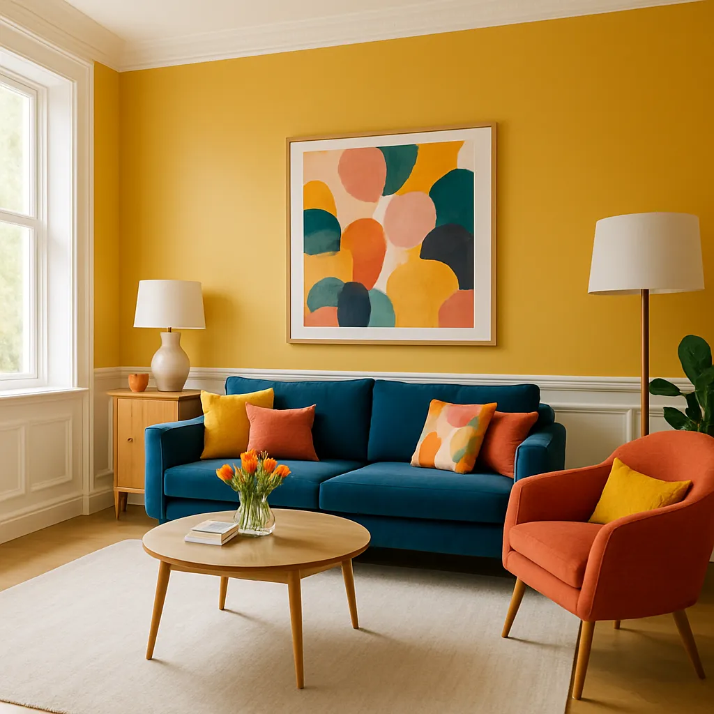
Paint an Accent Wall
Accent walls let you enjoy bold color without fully committing to painting the entire room. They also serve as a great focal point.
Accent Wall Ideas:
- Deep green or navy behind a bed or sofa.
- Terracotta or burnt orange in a dining nook.
- Muted pastel in a reading corner or office wall.
Balance the rest of the room with neutral or subdued tones.
Bring Color in Through Art and Decor
Art is one of the easiest and most impactful ways to introduce color into a room. It adds character and can tie a palette together.
Art Styling Tips:
- Use one large piece to introduce a bold tone.
- Create a gallery wall with coordinated but varied colors.
- Choose frames in black, white, or wood to keep the focus on the artwork.
Complement the colors in the art with smaller decor pieces across the room.
Use Plants for Natural Color
Greenery introduces natural color that feels vibrant and calming. Plants also bring life and texture to any decor style.
Plant Placement Ideas:
- Place a large leafy plant in a bare corner.
- Add trailing vines to shelves or walls.
- Use colorful pots to add another layer of color.
Even faux plants can add a touch of green to ground a space.
Let Lighting Enhance Your Color Choices
Lighting dramatically affects how color appears. The right lighting can make colors feel warmer, cooler, or more vibrant.
Lighting Tips:
- Use warm white bulbs (2700K–3000K) for cozy tones.
- Use natural light to its full advantage during the day.
- Add accent lighting (like LED strips or spotlights) to emphasize color in art or decor.
Test paint samples at different times of day to see how light affects the hue.
Final Thoughts: Confidence with Color Comes from Balance
Decorating with color doesn’t have to mean bold walls or bright furniture in every room. It’s about using color purposefully—balancing strong tones with neutrals, and layering thoughtfully to create warmth, personality, and flow.
With the right approach, even small touches of color can have a big impact. Start with what feels natural, build slowly, and trust your eye to find a balance that reflects your style beautifully.