Color is one of the most powerful tools in interior design. It can change the perception of space, influence mood, and create visual harmony or contrast. Whether you’re working with a small apartment or a spacious house, understanding how to use color effectively can completely transform your living areas. In this guide, you’ll discover practical tips, techniques, and examples to help you use color to your advantage in any room of your home.
Understand the Psychology of Color
Before choosing a color palette, it’s important to understand how different colors affect emotions and atmosphere. Color psychology plays a significant role in interior design.
Common Color Associations:
- Blue: Calming, great for bedrooms and bathrooms.
- Yellow: Energizing and cheerful, ideal for kitchens and dining areas.
- Green: Balancing and restful, works well in living rooms and offices.
- Red: Stimulating and warm, often used in dining rooms or accent walls.
- White: Clean, open, and neutral, perfect for making spaces feel larger.
- Black: Sophisticated and grounding, best used in moderation.
- Gray: Modern and calming, suitable for most rooms when paired with accent tones.
Choose colors based on the emotion you want to evoke in each space.
Choose a Base Color Palette
A cohesive base color palette ensures that your home feels connected and harmonious from one room to the next. A good starting point is to choose three main tones:
- Dominant Color: Used for walls and large furniture.
- Secondary Color: Found in curtains, rugs, or feature walls.
- Accent Color: Used in accessories, pillows, and art.
Examples:
- Neutral Base: White, beige, or soft gray with navy and brass accents.
- Earthy Palette: Terracotta, olive green, and off-white.
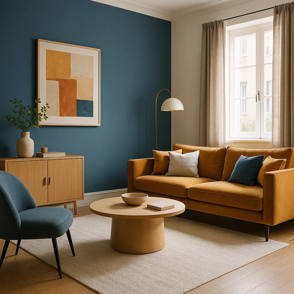
- Bold Modern: Charcoal, mustard yellow, and deep teal.
Using a consistent palette across different rooms creates flow and unity.
Create Depth with Contrast
Contrast adds visual interest and depth to any space. Use light and dark tones together to create dynamic interiors.
Tips for Effective Contrast:
- Pair white walls with dark furniture for a clean, dramatic effect.
- Use bold colors like navy or forest green as accent walls.
- Incorporate contrast in textures and materials, not just in color.
Contrast can highlight architectural features or serve as a backdrop for standout furniture.
Use Color to Define Zones
In open-concept homes or multipurpose rooms, color can help visually define different areas without using walls or dividers.
Ideas:
- Use a different wall color or rug to distinguish the dining area from the living area.
- Paint a reading nook or workspace in a calming tone to set it apart.
- Create a bold accent wall behind your sofa or bed to anchor the space.
This technique is especially useful in studios or large shared spaces.
Incorporate Color Through Textiles
Textiles like rugs, cushions, curtains, and upholstery are an easy way to experiment with color without committing to repainting walls.
Tips:
- Mix patterns and solids in the same color family for balance.
- Choose throw pillows in bold hues to freshen up neutral furniture.
- Layer different shades of the same color to create a cohesive, yet rich look.
Textiles allow you to refresh your space seasonally or as your tastes evolve.
Try Monochromatic Schemes
A monochromatic color scheme uses variations of a single color, which can create a sophisticated and cohesive look. It’s a great option if you want harmony without too much visual noise.
How to Make It Work:
- Vary the tones (light, medium, dark) of the color.
- Use different textures and finishes to avoid flatness.
- Add metallic or wood accents for contrast and warmth.
This approach works especially well in bedrooms and bathrooms where a calm atmosphere is desired.
Add Color with Art and Accessories
If you’re unsure about painting or investing in bold furniture, start with smaller decorative elements.
Examples:
- Wall art with bright or contrasting colors.
- Colorful vases, books, or trays on coffee tables and shelves.
- Lamps and light fixtures with unique finishes or tones.
This method allows flexibility and lets you test out colors before committing to larger changes.
Use Neutrals as a Foundation
Neutral colors provide a clean and timeless foundation. They work with almost every style, from modern to rustic to coastal.
Common Neutrals:
- White and Off-White: Brighten spaces and reflect natural light.
- Beige and Taupe: Offer warmth and versatility.
- Gray and Charcoal: Provide a cool, modern backdrop.
Use neutrals for large surfaces (walls, floors, major furniture), and build up layers of color through decor and accents.
Experiment with Accent Walls
Accent walls offer an opportunity to introduce color in a bold yet controlled way. They’re perfect for adding drama or creating a focal point.
Popular Choices:
- Deep blue or emerald green behind a bed.
- Burnt orange or rust in a cozy reading nook.
- Black or charcoal in a modern kitchen or bathroom.
Choose a wall that naturally draws the eye and make sure it complements the surrounding decor.
Final Thoughts: Use Color with Confidence
Color has the power to shape how a room looks and feels. Whether you’re going for a cozy and warm space, a bold and energetic one, or something calm and neutral, the right color strategy can completely transform your home.
Take the time to test samples, observe how light affects color at different times of day, and don’t be afraid to layer, mix, and explore. Your living space should reflect your personality and support your lifestyle—and color is one of the most effective ways to make that happen.