Color is more than a visual experience — it’s a language.
It whispers or shouts. It lifts or anchors. It tells the truth about how a space feels, long before a single word is spoken.
When we bring art into our homes, we’re not just decorating — we’re curating energy.
And color is the pulse of that energy.
This article isn’t just about color theory. It’s about understanding color as an emotional tool. We’re going to explore how the colors in art — whether framed, painted, or sculpted — shape the emotional temperature of your home. And why getting intentional with them might be the best design decision you’ve never made.
Why Color in Art Matters More Than You Think
You might think you’re drawn to a piece of art because it’s “beautiful.”
But beauty is just the surface.
What you’re really reacting to is how the color makes you feel.
Color hits the brain before logic has a chance to speak.
It influences heart rate, mood, memory — and even behavior.
So, yes. That bold red print in your living room? It’s not just an aesthetic choice. It’s changing how you experience that space.
The color of the art you bring into your home is like the background music in a movie. You may not notice it first, but it changes everything.
The Emotional Language of Key Colors
Let’s break it down — brutally honestly.
Here’s what the core colors typically do in the context of art and space:
🔴 Red – Passion, Action, Intensity
Use with caution. A red-dominated artwork activates a space. It raises energy and draws attention.
Ideal for: entryways, creative studios, or anywhere you want people to feel alive.
🔵 Blue – Calm, Reflection, Focus
Blue art slows the breath. It invites introspection and trust.
Perfect for bedrooms, offices, or reading spaces.
🟢 Green – Balance, Renewal, Connection
Green speaks to growth. When it shows up in art, it brings a natural grounding.
Use in shared spaces like living rooms, dining areas, or anywhere peace is needed.
🟡 Yellow – Optimism, Joy, Alertness
Yellow commands attention — but too much can feel chaotic.
Add yellow art where you want lightness: kitchens, breakfast nooks, or small creative corners.
⚫ Black & Grayscale – Depth, Sophistication, Stillness
Black and white art slows time. It feels timeless and serious. It’s minimal, but emotionally deep.
Use when you want to add weight to a wall — without overwhelming it with color.
🟣 Purple – Creativity, Luxury, Mystery
Purple tones are rare and dramatic. They lend a space an air of uniqueness.
A great choice for home studios or transitional spaces.
Color in art is less about the room’s size or light — and more about what you want to feel when you’re in it.
How to Choose Art by Emotional Goal — Not Aesthetic
Here’s a truth: most people decorate to match their rug.
But the people whose homes you remember — they decorate to match a mood.
Try this method:
- Ask: “What do I want this room to make me feel?”
- Then: “What color supports that emotion?”
- Finally: Choose or commission art that carries that color intentionally.
Want calm? Seek soft blues and greens.
Want power? Go for contrast and saturation.
Want safety and nostalgia? Neutrals with texture.
Use Color to Reinforce or Shift a Room’s Energy
The art in your home can echo the energy that already exists…
…or it can disrupt and redefine it.
- If your living room is soft beige, a bold piece with orange or fuchsia can breathe life into it.
- If your bedroom is moody and dark, a grayscale photo adds stillness instead of more drama.
- If your kitchen feels chaotic, bring in green — calm from chaos.
The key is knowing: do you want your art to amplify or to balance?
The Power of Contrast: Let Colors Talk to Each Other
Color doesn’t live in isolation.
Its meaning changes depending on what surrounds it.
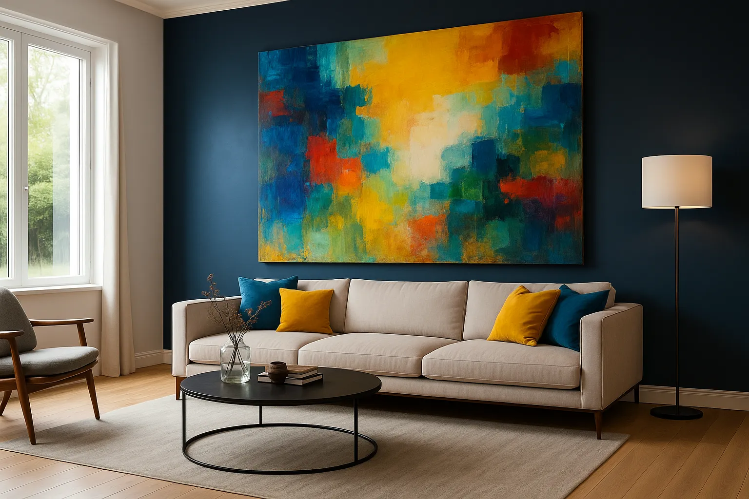
Put a yellow canvas on a white wall, and it glows.
Put it on a navy wall, and it pulses like the sun at midnight.
This is advanced-level decorating — and it’s where artists live.
Use contrast to create:
- Emotional drama (red on gray)
- Soft conversation (pink on cream)
- High-art feel (black on white, with metallics)
Let your art color speak to the room around it — or interrupt it intentionally.
Seasonal Shifts: Rotate Art to Align with Emotional Cycles
You’re not the same person in July that you are in December.
So why should your walls be?
Build a rotational system:
- Lighter, pastel or high-energy pieces in spring/summer
- Earth tones, muted abstracts, or grayscale in fall/winter
This small ritual changes more than just your decor — it keeps your home emotionally in tune with you.
What About Multi-Colored Art?
Some pieces don’t live in one color.
They are chaos and harmony in motion.
Here’s how to work with them:
- Use neutral furniture to let the art shine
- Choose one or two colors from the piece and repeat them in textiles
- Let the art be the mood board — not the afterthought
Multi-colored pieces carry complex energy — perfect for spaces that celebrate creativity or playfulness.
Final Thoughts: Color Is the Silent Emotion on Your Walls
You don’t need to study art history.
You don’t need to “get” color theory.
You just need to feel it.
If you walk into your home and feel tension — look at your walls.
If a room feels dull or distant — it’s not the paint. It’s the emotional climate, and art is your thermostat.
Color is never neutral.
It always says something.
So the real question isn’t:
“What looks good in this room?”
It’s:
“What do I want to feel when I’m here — and what color tells that truth?”
That’s when your home starts speaking back.